
It started with a muddy stick
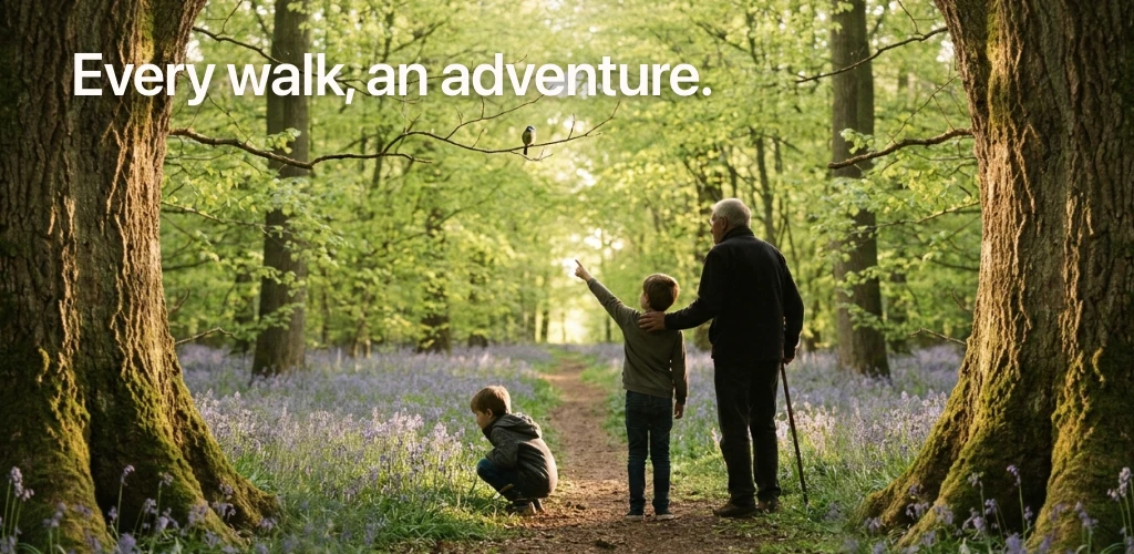
A hand-written scavenger hunt, a pen we’d forgotten to bring, and a six-year-old who decided the next best ticking-off implement was a stick dipped in mud. The page came home unreadable but triumphant. My wife looked at it and said I should build that app, so the whole thing is her idea.
For about a year, we’d been writing scavenger hunts by hand for our weekend walks. Ten things to find, scribbled on a page from a school exercise book, slipped into a pocket. They worked, and Tom loved them. The bottleneck was trying to think of something new each time. We didn’t want repeats, we wanted hunts that fit the wood or beach or park we were heading to, and that meant fifteen minutes of head-scratching every Saturday morning before we set off.
Peekabout is what came out of the conversation and experience: You select the terrain, the weather, the scavengers’ ages, and the app puts together a list of things to spot, listen for, count, and do. The phone stays in your hand (or pocket) and the kids do the rest. The iOS app went live on the App Store at the end of April; the Android release followed in May, so both platforms are in families’ hands in time for the school break.
What follows is the maker’s note. The why, the how it was built, and the few things I learned along the way.
Why this exists
Family walks are difficult to even get started. “I don’t want to go for a walk” turns into whining, “I’m tired” or “my feet hurt” or “carry me” after five minutes. The market response has mostly been “more screens”: step counters, AR creatures, points and badges. That works in the short run and undermines the thing the walk was supposed to do.
What the parents I spoke to wanted was simpler. A reason for the kids to look up. Something that turned the walk itself into the activity, and then got out of the way. Peekabout sits in that space with the app there to start the thing and quietly hold the list until the next find.
What's in the box
(woodland, beach, moor, …)
tuned for what they can do
every hunt feeds the library
and Challenge (timed)
The offline library starts at 450+ items and gets richer with every hunt anyone generates. Items the model produces are persisted server-side, so the next time someone walks into a beech wood with no signal, the fallback library has a few more beech-wood items in it than yesterday.
What it does
You set the scene in three taps. Where you are, what the weather is doing, who is with you. The app puts together a list of ten or so things to find, listen for, count, or do, and most of them are common by design. A yellow flower. A bird singing. A pebble that fits in a small palm. The trick the hunt teaches is the looking, not the finding.
The scavengers pick how they want to play once the hunt is ready. Explore lets them roam through the list at their own pace. Challenge runs a stopwatch and turns it into a race. The items are the same either way, so a mixed-age family can run a Challenge on the way out and an Explore on the way back, reading the facts and chatting about every find.
The feature I get the most quiet pleasure from is the free-text box on the setup screen. The terrain and weather pickers will get you a sensible hunt anywhere. The free-text box is where you tell the model what is special about here. Type “Marwell Zoo” or “Richmond Park” or “the Bongs” (the woodland path by the stream in Goostrey, Cheshire, that nobody who hasn’t lived there will have heard of) and if the model has anything in its training that knows the place, the hunt comes back tuned to it. We took it to Crewe Heritage Railway Museum and the hunt suggested looking for engine name plates, the ironwork details on the platform canopy, and foundry marks on castings. Not a single yellow flower in sight. We spent an hour on a hunt that fitted the place we were visiting.
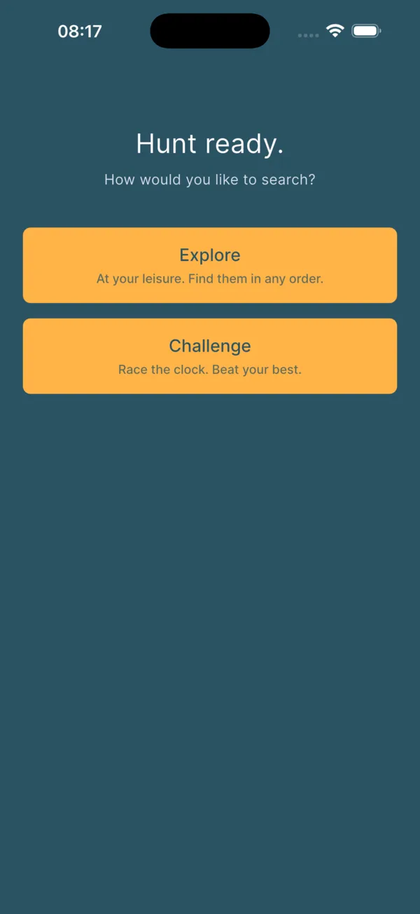
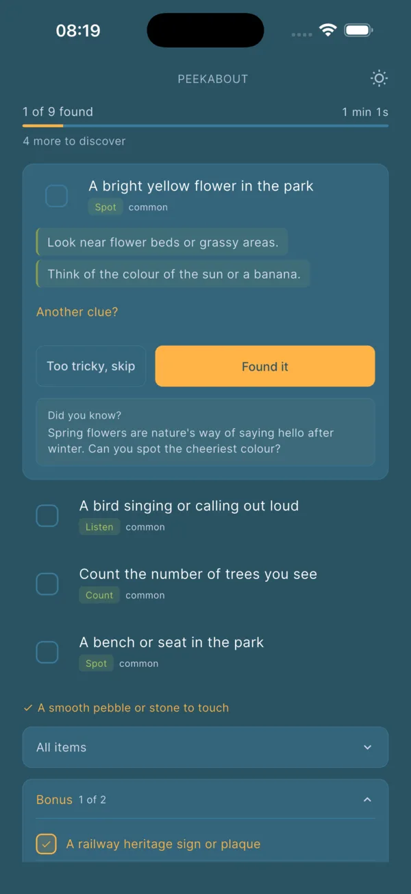
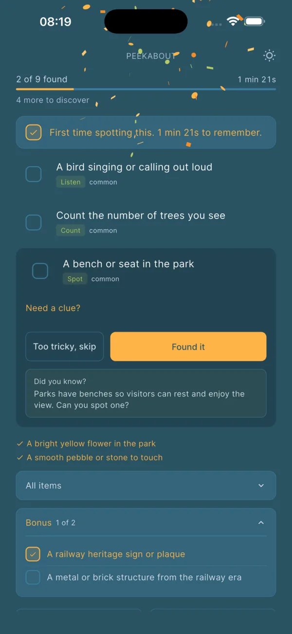
Pick a mode, work the list, find a thing. Repeat.
Each item carries a hint or two for stuck moments and a one-line “did you know” fact for the moment after a find. The fact is a bit of an added bonus - it turns a spotted robin into a thirty-second conversation about why robins keep singing through the winter when most other birds have gone quiet. The whole thing reads like the kind of detail a knowledgeable friend would mention on the same walk, which is the tone I was after. It has the added bonus of being interesting for the adults as well as the kids.
Building the app turned out to surface a load of categories I had never thought to write into a hand-made hunt. My pen-and-paper lists defaulted to spot-this-thing items. The model adds Action items (build a small cairn, count the steps to the bridge), sensory items that lean on smell or sound (something that smells of pine, a sound you cannot identify), and organising or comparing tasks (find three leaves of different shapes and put them in size order). Those were the genuine joys of the build for me. Every one of them is now the kind of item the kids ask for by name.
One thing the screenshots don’t show. Hunt generation currently takes about thirty seconds, which is longer than I would like. The loading screen does what it can with the time: a calm animation and a few cycling messages designed to give the adult setting up the hunt something to enjoy reading while the model puts the list together. Speeding it up is on the list. I haven’t decided yet what the right approach is.
How it works under the bonnet
The app is Flutter on iOS and Android. The hunt itself is generated by a small Cloudflare Worker that talks to Claude and returns a structured list. The Worker handles the fiddly bits: shaping the prompt, rate-limiting, caching identical requests so two phones in the same kitchen don’t pay twice. Local data lives in Drift, a typed SQLite layer. State is managed with Riverpod. None of this is exotic. All of it is deliberately quiet, because the interesting thing is supposed to happen on the walk.
The round trip is around thirty seconds today, and after that your phone has everything it needs for the walk.
Once a hunt is generated, the phone has it. The Worker is done, the model is done, and the rest of the walk works without signal. The fallback library currently holds 450+ curated items and gets a little richer every time someone generates a hunt, because the model’s outputs are persisted as future fallback entries. Useful for deep woodland, beach huts, and most of rural Wales or Devon.
What stays on the phone
The privacy posture is the thing I tightened most carefully, because it is the thing parents are right to ask about. The simplest way to describe it is by what the server sees and what it doesn’t.
Four fields go up. A list comes back. The payload is discarded.
The ages are integers. The app has no concept of a user account, an email address, a child’s name, or a device location. None of those exist in the data model, so none of them can leak. The Worker stores the request long enough to return a result and the cache key long enough to honour a five-minute retry window. Anthropic’s enterprise terms forbid training on the data. There are no third-party analytics scripts in the app and none on the marketing site beyond Cloudflare’s first-party page-view counter. The privacy policy describes this in full at peekabout.app/privacy, and it is short on purpose. If a privacy policy needs ten pages, a real person isn’t going to read it and they’ll assume you’re hiding something in the small print.
How I built it
The thing I want to share most clearly is the workflow, because it pleases me. This was not a vibe-coding project. I did no upfront work in Claude Code, nor did I use some vibe-coding platform. The whole architecture, the design language, the security posture, the data model and the rough roadmap were worked out by me using the Claude desktop app first, and then handed over to Claude Code as a finished brief.
A few thousand lines of decisions made before any code was written. Then press go.
For me, the Claude desktop app turns out to be a more comfortable place for the wandering kind of thinking that comes early in a project. The chat surface is generous, you can paste images, you can sketch a flow and change your mind, and you don’t have to think about file paths until you want to. I spent maybe a week of evenings in there. Out of it came a bundle of markdown files. Design and information architecture, infrastructure choices, the initial security threat-model (and the controls that follow from it), and a roadmap with phases. The decisions were thought through before the keyboard came near a build tool.
Then I downloaded that bundle into a fresh Claude Code project folder and pressed go. From there it was iterative. Fine-grained questions, testing on the iOS simulator and on a real Pixel, feedback loops that got tighter as the design ran into reality. Where the markdown files were wrong, I updated them and the codebase together, so the project documentation always reflected the running app rather than the original plan.
The affirmation, now the initial work is done: design tools and build tools are different jobs. Letting them be different jobs, on two different surfaces, gave each of them more room to do their work properly.
This is partly career-shaped. Most of my working life has been spent on the seam between human intent and engineering: listening to business needs, writing product specs, shaping requirements, decomposing scope, briefing developers in language they can ship from. Splitting the brief into a handful of well-scoped documents (architecture in one file, security in another, the roadmap in a third) is the way I would have written it up for any other team. The implementer being an LLM doesn’t change the value of writing the brief properly. Claude Code will happily build whatever you point it at, very quickly, including the wrong thing.
The same habits that make a good product spec made a good Claude Code project: each document had a clear scope, named its dependencies, and left an obvious next instruction at the bottom. When I asked Claude Code to implement a feature, I could point it at the section of the document that owned the decision and say “build this.” That is the same thing I would have said to a developer in a kick-off meeting (though more directly, perhaps), with the same expectation that they would come back with sensible questions before writing code. Most of the time, it did.
What I implemented along the way
Reuse what you already built
Peekabout looks the way it does because most of the visual language was already paid for. Colours, type, dark and light handling, spacing rhythm: all from the Sunlight design system I built for my daylight-tracking app. I spent design time on the things that genuinely needed it. The hunt-item card, the little celebration when a find is logged, and the accessibility. Everything else came in for free. As a solo builder, a shared design system pays back faster than feels reasonable.
Quiet infrastructure does most of the work
The Worker does the unglamorous things: Validates input, caches identical hunt requests for five minutes so a duplicate tap doesn’t burn a model call, and returns a useful error code, not a 500, when the upstream is rate-limited. None of that is interesting on its own, and all of it is what stops a Sunday-afternoon walk turning into a Sunday-evening support ticket.
Some of the worst bugs are silent
The first TestFlight build was a quiet disaster. The Xcode Archive flow ran without the dart-define for the API base URL, so the app shipped pointing at localhost. The connection failed on every device. A defensive piece of code I thought was being helpful (an offline-fallback in the hunt service) swallowed the error and used the local library instead. To the testers, it looked like it was working (very quickly). To me, it looked like nobody was using it.
The fix took a few minutes. The lesson took just as quick: Crash loud - failure paths must be visible during development. The friendly fallback comes later, once the happy path is proven.
Don’t trust the simulator
I don’t own an iPhone. The whole iOS development cycle ran on the simulator, with TestFlight builds for real-device testing by friends and family. The simulator is fine for most things but the (now) known exception is emoji rendering, which has been broken for several Xcode releases now and which Apple has acknowledged but never quite fixed. I lost the better part of an hour to chasing what I thought was Claude code being lazy, before a TestFlight build on a real device confirmed the emoji was perfect, the simulator was the liar.
For a solo developer who can’t lean over and pick up an iPhone to check, that bug is a slow tax. The mitigation is to buy an iPhone, but that’s quite a monetary investment in the short term. In the meantime, I had Claude create a list of known “simulator-only artefacts” and have it referenced in the project doc so I don’t fall down the same hole twice.
Three constraints that shaped everything
Phone in pocket
Once a hunt starts, the screen should be glanced at, not stared into. Big buttons, calm typography, hunt list visible at arm's length.
Walk-shaped
Hunts last ten to twenty-five minutes by design. Long enough to feel earned. Short enough that the next walk can be a fresh one.
Honest about ages
A four-year-old stacking three pebbles and a thirteen-year-old building a two-person shelter are both legitimate finds. The list adapts.
Satisfying outcomes
My son now asks for a scavenger hunt on every walk (sometimes he asks for two). He has worked out that woods have personalities, and that the way to get to know one is to do a hunt in it. I had not designed for that. The app is doing the job of starting the walk, the rest is him.
One of the most pleasing things (because it’s how we all judge a good tool), is how simple the app feels to use. Three taps to a hunt, the adult holds the phone and reads the next item out loud, the kid keeps their head up and looks out at the world. The interface gets out of the way the moment the walk has started. If someone else had written the app and I was asked, I’d say that is a sign of good design or good development.
The wider surprise is how few real product decisions a useful app can carry. There are perhaps a dozen of them in Peekabout. Most of the development time has gone into making those decisions feel inevitable: an interface that disappears once a hunt starts, the offline fallback, the sensible defaults that mean three taps gets you a hunt, the typography that stays readable when the phone has been in a damp pocket and is being held by someone with mud on their hands.
If you’d like to try it

Peekabout
£3.99 once. Live on iOS and Android.
Peekabout is live at peekabout.app, on the App Store and on Google Play. There is a free in-browser sample if you want to generate one without installing anything. The app is £3.99, paid once, and that is the entirety of the commercial model.
If you are writing about Peekabout, the press kit has logos, screenshots, the founder note, and contact details for follow-up.
If you are building something small for the people you love, do tell me about it. Those are the projects I most want to read about.
Related reading: Sunlight: One Design System, Many Surfaces is the design system underneath this app. I Built My Family a Chief of Staff is a different small thing built the same way. The Coffee Link is the broader ethos: build because you want to, leave a polite door open for the people who find it useful. Card Stash is another solo app, a loyalty card wallet that never phones home.