
Sunlight: One Design System, Many Surfaces
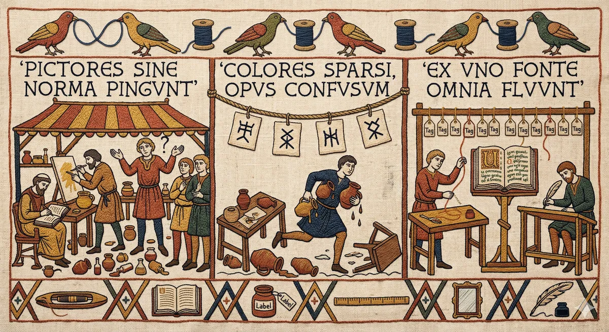
Every colour on this website has a name, not a hex code. The amber you see on links is --accent. The dark background is --bg-primary. The muted text beneath headings is --text-secondary. Nowhere in the CSS will you find a raw #F59E0B pasted into a component, only references to a shared vocabulary of roles.
That vocabulary is the Sunlight design system, and it runs in more places than just this site.
The problem it solves
I build things across several platforms. Sunlight is a Flutter app for tracking daylight. This website is Astro deployed to Cloudflare. The Family Sentinel is a MagicMirror² dashboard on a Raspberry Pi. Each runs on a different stack, in a different language, on a different screen.
Without a shared system, each project drifts. Colours diverge. Spacing feels inconsistent. You end up making micro-decisions about padding and border radius every time you touch a new component, decisions that feel small individually but compound into visual incoherence.
A design system eliminates those decisions. You define them once, reference them everywhere, and move on to the interesting problems.
What Sunlight actually is
Sunlight is a set of design tokens: named values for colours, typography, spacing, border radius, shadows, and transitions. The tokens are organised by role rather than appearance:
Token Categories
The aesthetic is minimal, warm, and precise. Dark mode uses deep slate backgrounds with warm amber accents. Light mode shifts to soft ivory with stone tones. No gradients. No heavy shadows. Depth comes from borders, opacity, and subtle contrast.
Colours are named by what they do, not what they look like:
bg-primary: the page background, whatever that means in the current themeaccent: the colour that draws your eye to interactive elementstext-secondary: supporting text that shouldn’t compete with headingspositive/negative: semantic states, not specific greens or redsdivider: structural separation, tuned per theme for appropriate contrast
This means switching from dark to light theme is a matter of swapping values. The components don’t change. The layout doesn’t change. Only the palette does.
One source, many outputs
The canonical token definitions live in the Sunlight Flutter app’s codebase, in a Dart ThemeExtension class. From there, the same values are expressed as:
- CSS custom properties for this website:
var(--accent),var(--spacing-base),var(--radius-md) - Flutter ThemeData for the Sunlight iOS and Android app
- Inline CSS for the MagicMirror² smart mirror modules
If I decide tomorrow that accent should be a different shade of amber, I change it in one place and every surface updates. The website. The app. The mirror. No find-and-replace across three codebases. No forgotten component still using the old colour.
This is the real value of a design system: not that it makes things look pretty (though it does), but that it makes change cheap. A new colour scheme doesn’t mean auditing every file. It means updating a handful of constants.
The philosophy behind the choices
A few deliberate constraints shape Sunlight:
Dark-first. Most of my surfaces are screens used in varied lighting: a phone checked at dawn, a mirror glanced at in a dim hallway, a website read late at night. Dark mode is the default. Light mode exists for print and content-heavy reading.
Roles over values. No component ever uses a hex code directly. This is enforced by convention, not tooling, but it holds. If you can’t name the role, you probably shouldn’t be adding a new colour.
4px base unit. Every spacing value is a multiple of 4. This creates a rhythm that’s hard to see consciously but easy to feel. Elements snap to a grid. Padding feels deliberate. The eye relaxes.
Two fonts, no exceptions. Inter for body text. JetBrains Mono for code. Both are variable fonts, self-hosted. No layout shift, no FOUT, no surprises.
Borders over shadows. In dark mode, shadows are invisible against dark backgrounds. Sunlight uses card-border and opacity for depth instead. Shadows are reserved for light mode, and even then they’re minimal.
See it in action
I’ve built an interactive style guide that renders every token, component, and state from the system. You can toggle between dark and light themes, inspect colour swatches with their hex values, and see the full type scale and spacing system visualised.
View the Sunlight Style Guide →
The markdown specification is also available if you prefer a flat reference document, useful for handing to an AI or a collaborator who needs the raw values.
What tokens buy beyond aesthetics
Design systems are sometimes dismissed as a luxury for large teams with dedicated design functions. For a solo builder shipping across multiple platforms, a shared token system is arguably more valuable:
-
Decisions compound. Every time you hardcode a colour or guess at a padding value, you’re creating a future inconsistency. Tokens eliminate the guesswork.
-
Change stays cheap. Want to experiment with a warmer background? One variable. Want to tighten the type scale? A few tokens. The blast radius of a design change shrinks to the system definition, not the entire codebase.
-
New projects start faster. When I built the smart mirror modules, I didn’t spend time choosing colours or debating button styles. I pulled in the tokens and started solving the actual problem: how to surface family logistics at a glance.
-
Consistency is trust. When every surface feels like it belongs to the same family, people (and you) trust it more. It feels intentional, even when some of it was built at midnight.
The Sunlight system is small: a few dozen tokens and a philosophy. It underpins everything I ship. It’s the reason the mirror in my living room and the website you’re reading right now feel like they belong together.
Related reading: The Coffee Link is the reflective companion to this piece, on why I built the app in the first place. I Built My Family a Chief of Staff. It Runs on a Raspberry Pi. is the smart mirror that runs the same tokens on a third surface. It Started with a Muddy Stick is the Peekabout build journal, where the same tokens land on a fourth surface. Card Stash is a privacy-first loyalty card wallet built the same solo way, with no network calls at all.